The state of web ads is over a century in the making
Preface: I was originally going to go on a rant but fell down a rabbit hole of looking at examples of older newspapers and instead this became more of an article/blog.
Like many other people focused on their privacy, I run Pi-hole at home to block advertising domains, among other annoyances, and personally make extensive use of Privacy Badger and NoScript. The Pi-hole alone has the effect whenever anyone of the household is out of the building and not connected to our home's wifi, they get the jarring experience of seeing a completely different version of the web, plastered with ads, most of which are animated and attention-grabbing. This is especially true in mobile apps.
There's been a lot of lip service given to the way the “old web” used to appear versus how things are now, so I'm not going to do more of that here. I think what a lot of us “web old-timers” maybe don't realize is that how the web looks now is actually pretty common and has its origins in the way newspapers and magazines were laid out in the past.
If you've never had cause to go back and look at old newspaper archives, you might not have experienced this, so I'm going to show you some examples. You'll see the bones of modern web advertising buried in newspapers a century old, and then I'll explain what I think is critically different about how the web is these days. Spoiler: it's not better.
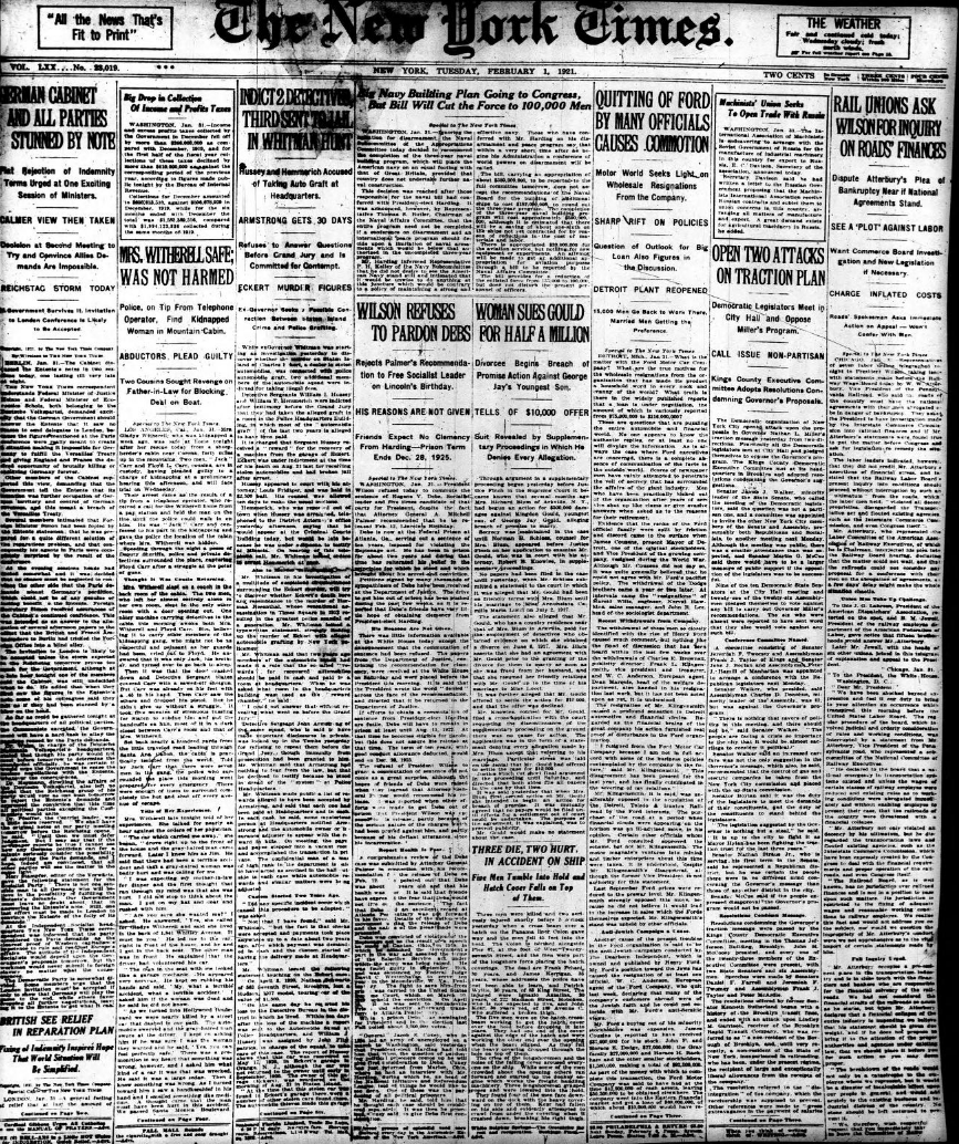 ref: https://archive.org/details/NYTimes_feb1_15_1921/page/mode/2up
You can see there's a few modern innovations in papers missing here — no “above the fold” style of breaking up the layout. Another trick newspapers did initially was to never put the ads on the front page — they were selling you the news after all.
Now onto page two:
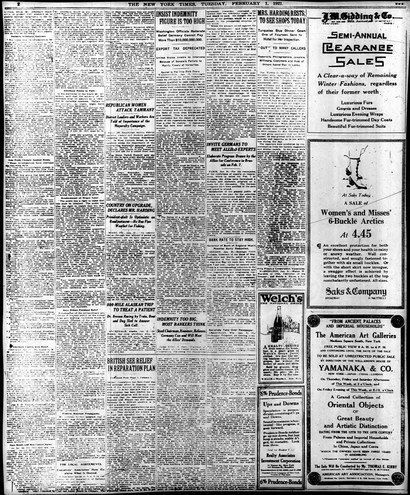 ref: https://archive.org/details/NYTimes_feb1_15_1921/page/n1/mode/2up
This layout is common amongst the meatier news-focused sections of the paper. The first 5.5 columns are dedicated to news stories and then the rest is devoted to ads. Three are larger double-column spaced ads, while two are smaller and occupy the space in an ad. The rest of the Times' early layouts in the news sections were like this, with sometimes more space dedicated to ads on the lighter topics.
For example, here's the sports section:
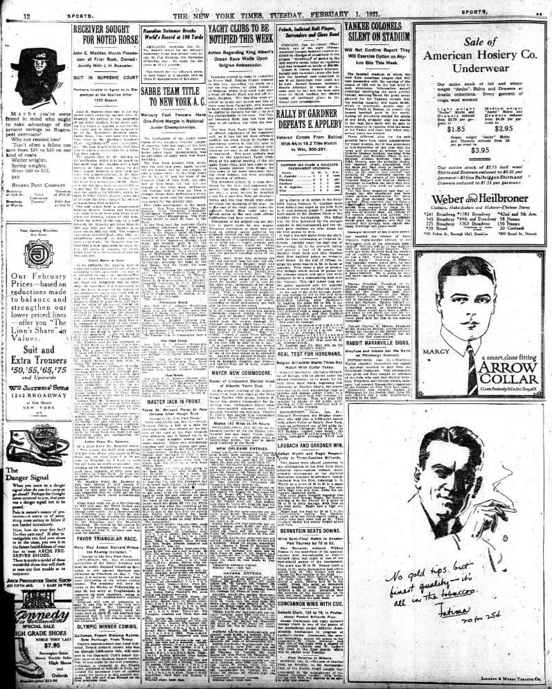 ref: https://archive.org/details/NYTimes_feb1_15_1921/page/n11/mode/2up
Here ads are placed in a very familiar format for the modern web; The ads effectively bookend either side of the center columns which house the articles themselves.
However, it's worth noting this layout was not universal. Here's an example of the Victoria Daily Times, from Victoria, British Columbia:
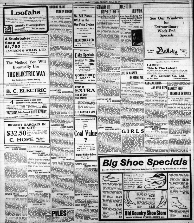 ref: https://archive.org/details/victoriadailytimes19210722/page/n1/mode/2up
I can only imagine its print runs were much smaller than the New York Times. The paper lives on to this day as the Victoria Times Colonist, having merged with another local paper in the 1980s. Attempting to read this layout now, I understand why the format the Times is using won out over other layouts. The ads being so close to the article is visually distracting.
Now let's compare those older examples to modern web news media. Let's start with a relatively tame example: Yahoo! News:
 ref: https://us.yahoo.com/news/sister-andr-worlds-oldest-person-183029182.html
Here you can see the remnants of the earlier newspaper design. The page is divided into roughly fifths, and a fifth is allocated to the side ads. All in all this doesn't look too unreasonable, but let's now look to what modern newspapers' sites look like. Here's the front page of the New York times:
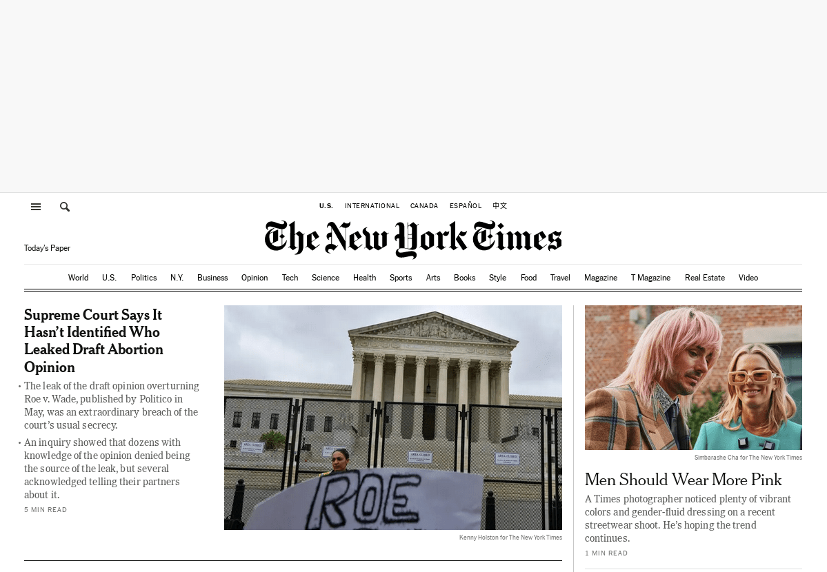 ref: https://nytimes.com/
Because of the nature of the web and the drive to obtain impressions versus what works in print there's a huge functional difference: Each article is given its own webpage, so what is displayed on the main page landing page actually looks more like older newspapers, where a single viewing space — in that time period, paper, in ours, screen real estate — is subdivided into several articles. I don't have any insider knowledge or analytics but I believe that in today's social media dominated world, most users do not visit the front pages of newspaper sites, yet the philosophy persists of the relatively “clean” first page.
Now let's look at what happens when we load an article:
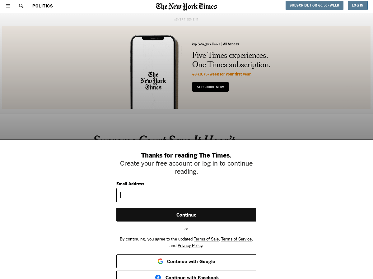 ref: https://www.nytimes.com/2023/01/19/us/politics/supreme-court-leak-roe.html
Here we can see probably the worst feature of modern advertising: the pop up modal dialog requesting subscription or registration. This is commonplace among all newspapers websites at this point in time and that's not news to any of you. On what should be an article page the title is not even visible! There are two separate subscribe buttons visible, plus our lovely “create an account” modal dialog.
Not that I'm unsympathetic, the trials of various news organizations are well documented so I don't need to go into them here. What I would like to highlight is simply that some philosophies and design elements in use a hundred years ago persist. For example, we still have the behavior of keeping the first point of arrival largely ad free. Not completely of course, because the tombstone of the 2015+ web will be engraved with “Subscribe, Click that like button, and share it with your friends”, but the front page is relatively ad-free compared to the hilarious experience of trying to view an article.
On that note though, the viewing an article experience is very reminiscent of the Victoria Daily Times' layout. Maybe they were right all along.
The problem this creates is that whenever I visit friends or family who aren't tech-savvy, I realize just how bombarded they get with advertising.
It also really drives home Google's impetus for working on DNS-over-HTTPS and Manifest V3: It will help them take back control over ad visibility in the era of every user using an ad blocker in their browser and things like Pi-hole becoming cheaper and simpler for people to run at home.